Project:
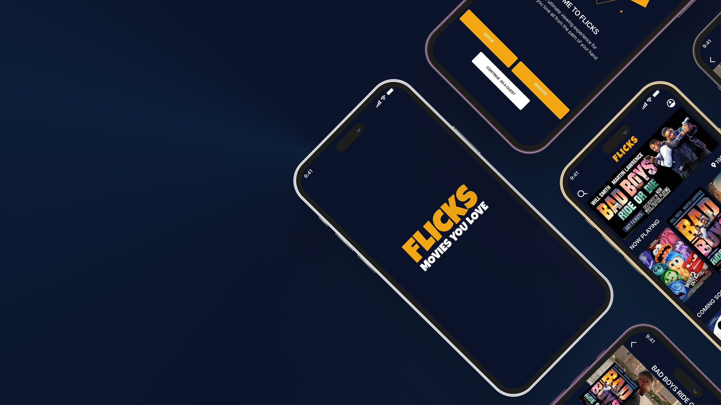
The Flicks Movie app is a new and exciting way of how movie lovers and goers, just like you and I, can purchase tickets, reserve our favorite seats and even order food and beverages ahead of time, all from the palm of our hands.
Project Role:
I was the Sole UX/UI designer for this personal project
Responsibilities:
Research and gather insight through interviews and usability studies
Define and come up with solutions for the user’s problems
Ideate and Iterate design through wireframe, lo-fi and hi-fi prototypes
Project duration
May 2024 - June 2024
The Problem
Movie goers who purchase movie tickets the tradition way tend to face challenges, such having to wait in long queues at the box office, not be able to select the seats that they would’ve have found ideal or find that tickets are sold out before they even make it to the ticket booth. These pain points lead to a less than pleasant experience for the average movie goer.
The Goal
As such I bring to you the Flicks Movie app as a more efficient and easy way to purchase movie tickets and reserve theatre seats all at your own convenience from your smartphone.
My Design Process
I followed the design process outlined below:
EMPATHIZE
User Research Summary
I began my research by first carrying out a screener survey with 10 individuals from my target audience between ages 18-47. The aim was to recruit a diverse group of interviewees.
From the survey, I selected 5 individuals to participate in a brief interview, to gain valuable insight about their thoughts and feelings around their experiences of going to the movie theater. The interview consisted of questions geared to, inquire about their experiences at the movie theatre, their movie going frequency and their method of ticket purchase.
From The interview, I was able to deduce 3 pain points based on the responses from the interviewees.

Pain Points
1
Long Queue wait time
“We waited in the concessions like for 5-10 mins before we gave up, and then just tried to get to the theater.”
2
Poor customer service
“I didn’t even ask for a refund, just wanted a credit because I had an emergency on the way to my showing. I also wasn’t able to cancel before the showing and they basically told me no refunds, or exchanges after the showing no matter what the circumstances are. ”
3
Unsanitary theater condition
“The place was so filthy and the snack bar never has anything available. The soda machines were all disgustingly dirty and sticky. The carpets were also so gross.”
DEFINE
User Personas and Journey map
Based on the insight I had gotten from the interviews, I was able to develop 2 personas to gain a better understanding of the users unique needs, behaviors and preferences. I also created a user journey map to visualize the steps the user takes to successfully booking movie tickets.
User Personas

After I created each persona I developed a problem statement for each, to summarize who they are, what they need from the design and why they need it.
Problem Statement
Ronnie’s Problem Statement
Ronnie is a family man who loves going to the movies but feels the prices are sometimes too high. He needs easy to use app to order movie tickets, so that he can reserve the best seats and preorder snacks so that they can avoid the long Queues at the theater.
Suzie’s Problem Statement
Suzie is a Honduran exchange student, who sometimes has a hard time reading English. Taking her language barrier in to account, she needs an app that will allow her to conveniently book theater ticket at a top rated theater, so that she can have a comfortable viewing experience.
User Journey Map
IDEATE
User Storyboard, User Flow and Information Architecture
In this phase of the design process, I began to brainstorm and documenting my ideas on possible design solutions for the user’s pain points. This was done through creating User Story boards, User Flow and Information Architecture. As you will see below:
User Storyboard
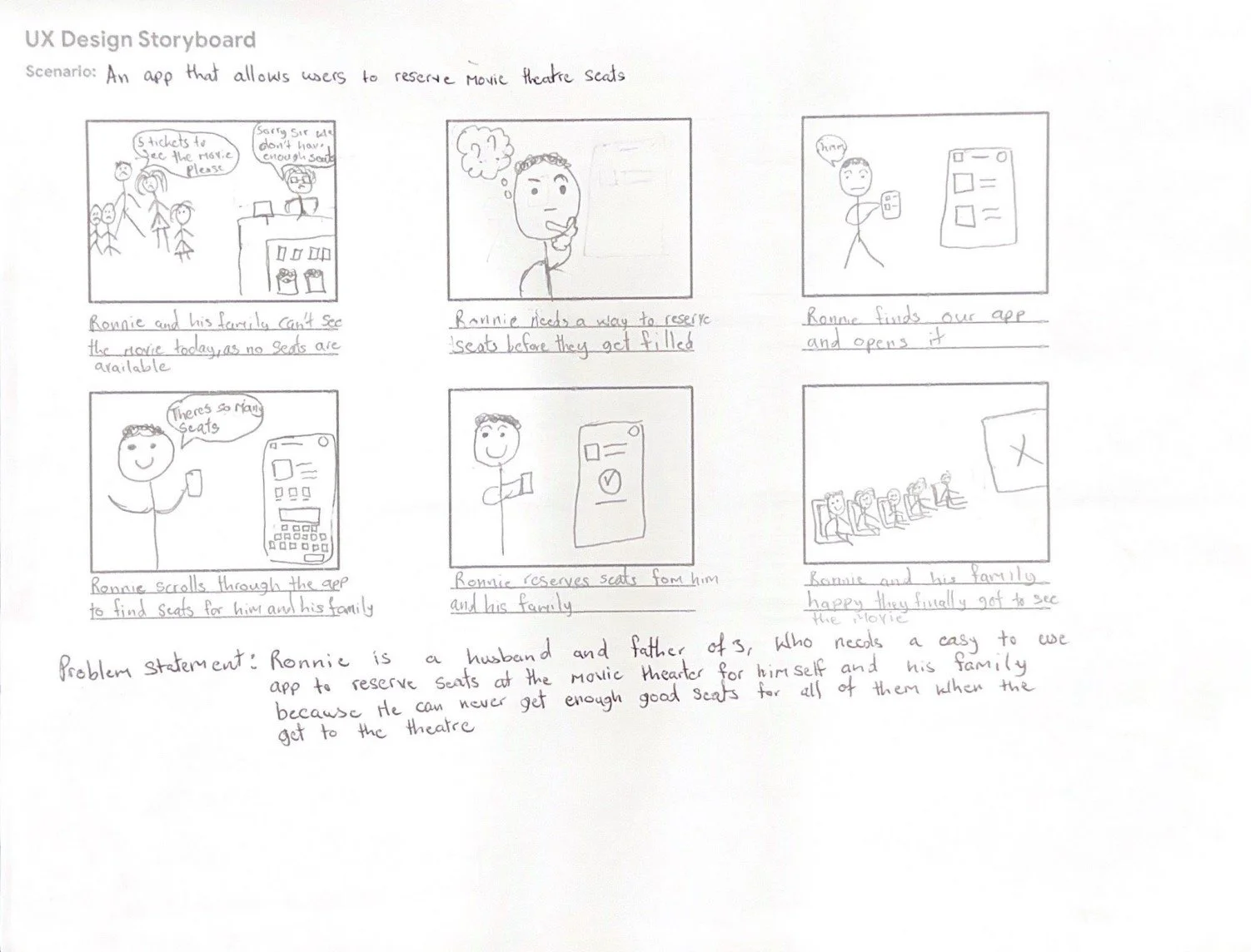
A Big picture storyboard was created to visualize the journey our persona Ronnie would follow to purchase movie tickets through the flicks app, focusing on his emotions and overall experience. A Close-up storyboard was also created to highlight his actions he takes inside the app to complete the order process. You can see both storyboards in the carousel below.
The Flicks App User Flow
I created a User Flow diagram to illustrate the main process the user will follow to complete their main task of purchasing movie tickets
Information Architecture
I then developed the Information Architecture, to assist me with organize all the content the app would hold and also understand the overall structure. In turn this will help the user better understand where they are in the app and the information that they are looking for.
Paper & Low Fidelity Wireframing
As I continued through the Ideation phase, I began to sketch Paper wireframes focused on the main task referenced in the user flow diagram, and organizing the content referenced in the Information Architecture to create a design that will be seamless and intuitive user experience. For each screen of the app, 5 sketches were created and the best parts of each sketch was organized in the final design screen as seen the image below.
My focus point for the iteration was to create a simple and straight forward, to ensure easy navigation for the users.
My sketches may not be the best, but from them I went on to create low fidelity wireframe in Figma, that were both clean and organized.
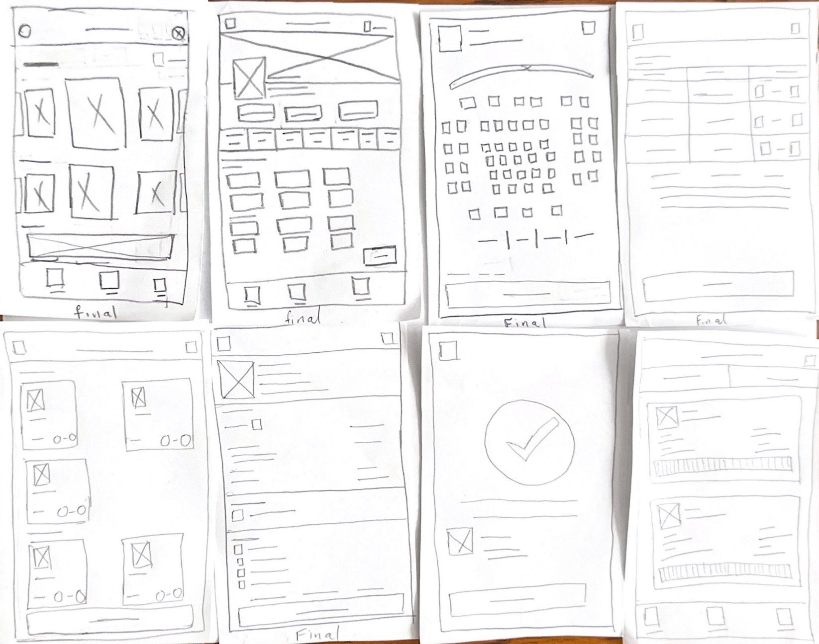
Paper Wireframe
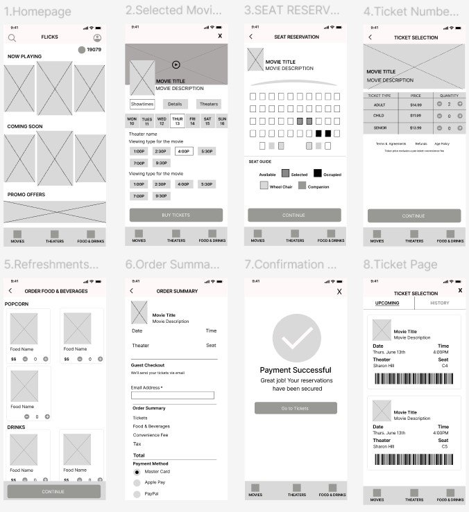
Low Fidelity Wireframe
PROTOTYPE
Low Fidelity Prototype
After creating my low fidelity wireframe, I then moved on to creating Low Fidelity Prototype through adding interactivity to the wireframe.
Test
Usability Study
After completing the Low Fidelity Prototype, it was time to test the app and develop insights to improve it based off of first hand user feedback.
I carried out 5 moderated usability studies, using the same 5 participants from the initial interviews in the empathize phase.
Affinity Map
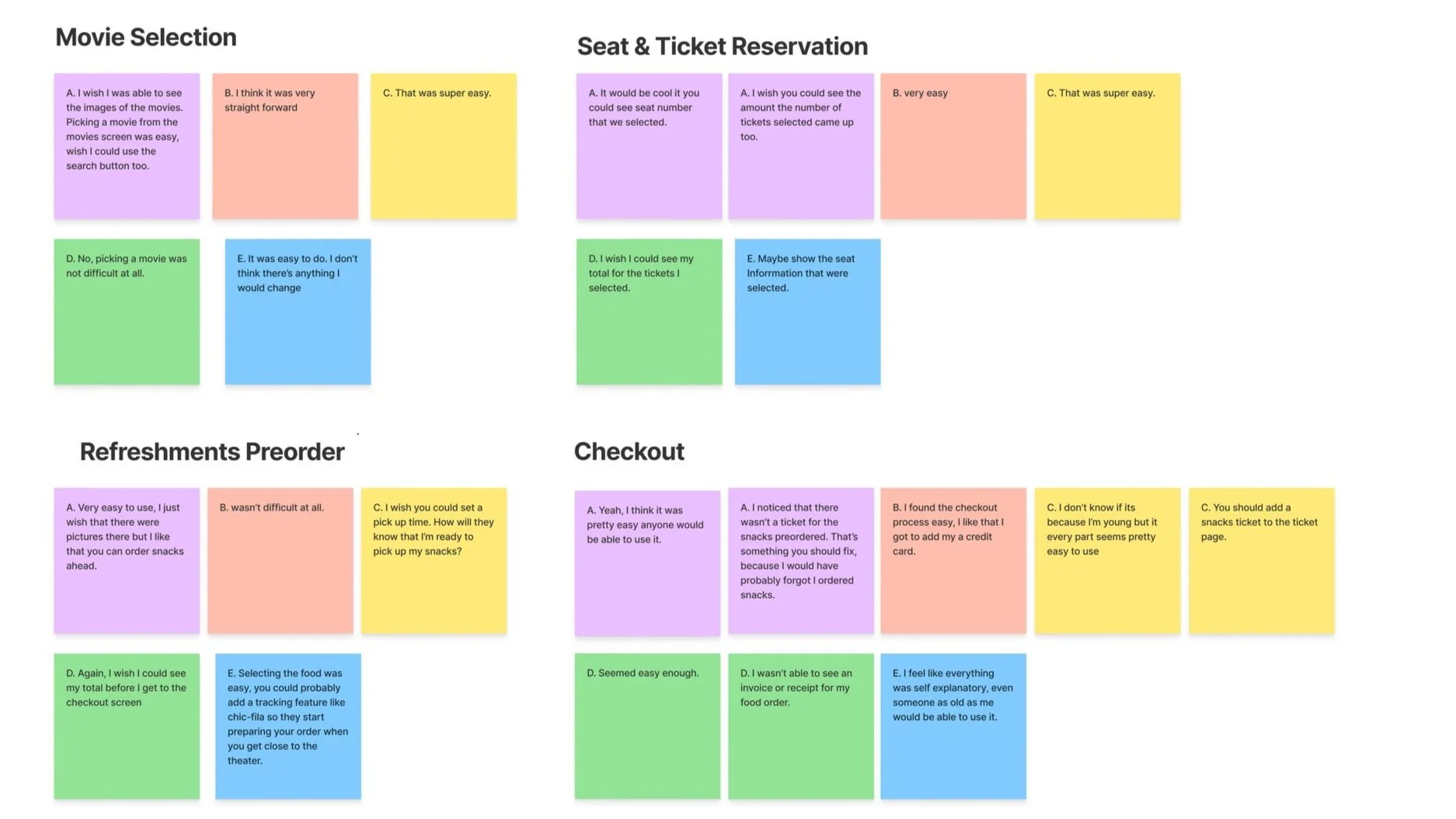
The participants were given the same 5 tasks to complete as they navigate through the main user flow of the app and asked follow up questions after each task to gain their immediate impression for the interface. Their feedback was compiled in an affinity map. I then used this to develop patterns and themes.
Themes
5 out of 5 participants found it easy to select a movie from the movie screen.
2 out of 3 Participants would like to be able to see their selected seats details on the seat reservation screen.
2 out of 5 participants would like to be able to see their ticket total price on the ticket quantity selection screen.
4 out of 5 participants would like to have a way for the theater to know exactly when to have their snacks ready for pick up.
5 out of 5 participants found the checkout process to be easy.
3 out of 5 participants would like to be able to see their snack order receipt/ticket on included in the tickets page.
Key Performance Indicators
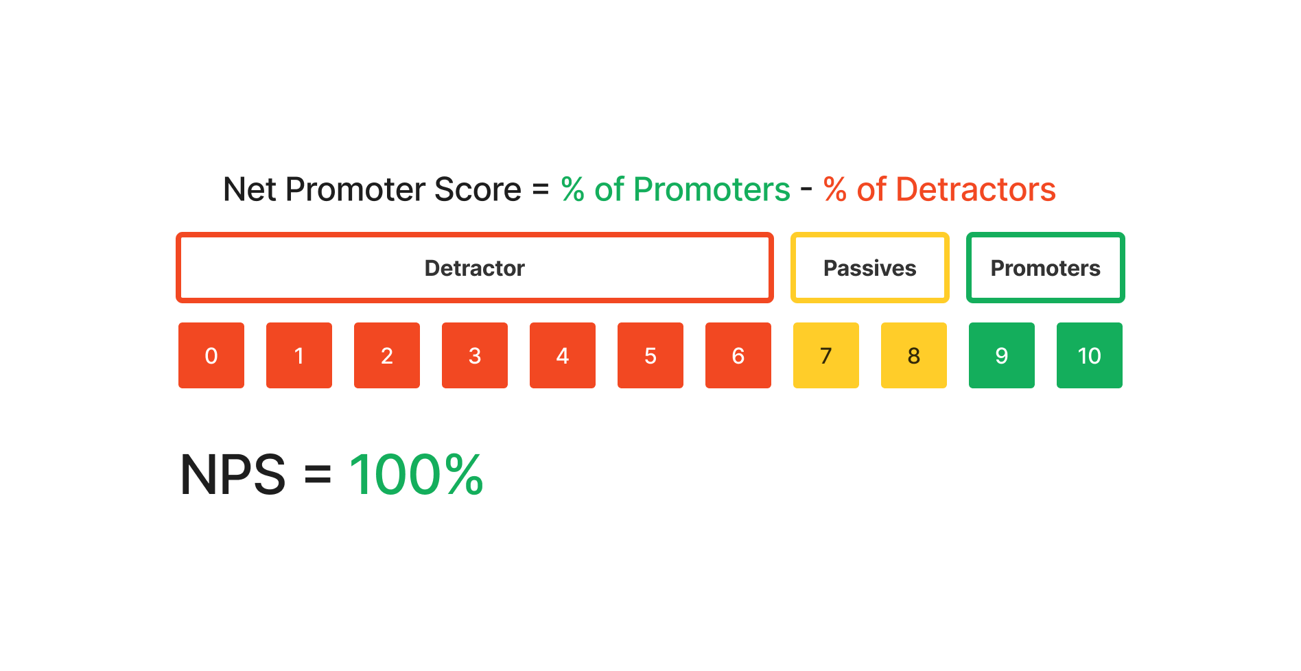
I utilized 2 KPIs (Key Performance Indicators) to track well users believe the app performed. These KPIs were, Conversion rate and Net Promoter Score (NPS) which is a rating scale from 0-10 measuring how likely the participants were to recommend the app.
Insight
Users prefer to see the seat number selected on the seat reservation screen.
Users prefer to see the total price for their selected snack and ticket items.
Users need a feature that allows them to set a pick up time for their preordered snacks.
Users need to have access to a receipt or invoice for their snack order.
Conversion Rate
100%
All users were able to complete all tasks.
Design Refinements
To address the insight, “Users need a feature that allows them to set a pick up time for their pre ordered snacks.” I added a Pickup time feature, that allows users to set a pickup time within 20 mins prior to the showtime and 10 mins after.
It also addresses Insight, “Users prefer to see the total price for their selected snack and ticket items.” I added a totals feature, that shows our users the total price of the tickets selected.
To address the insight “Users prefer to see the total price for their selected snack and ticket items.” I added a totals feature, that shows our users the total price of the tickets selected.
To address the Insight, “Users need to have access to a receipt or invoice for their snack order.” a Snacks tab was added to the Tickets screen, so users will be able to view both their Movie tickets and there snack preorder tickets in the same place.
Design Features vs Pain Points
In This section, I will show how the additional features developed during the Ideation phase applies to each pain point attributed to our personas earlier in the study.
Pain Point #1 Long wait Queues
The designs main user flow was designed to address our personas pain point by eliminating the need for them to have to wait in long lines at the Ticket booth and snack bar. I found that providing the user with a pay to book tickets online as well as pre order their snack and set a specific time for pickup a great solution to this pain point (This theory of mine will be tested later in our second round of usability studies)
Pain Point #2 Poor Customer Service
The issue of customer service is a lot deeper than just adding a single feature to address every possible poor service situation. I took this opportunity to design a feature to address to address a common yet specific issue that could lead to a poor customer service that being customers needing a refund for whatever the issue may be. I tried to keep the process as simplistic as possible only requiring a few clicks to complete the whole refund request process.
Pain Point #3 Unsanitary/Unfavorable Theater Conditions
To assist our users in avoiding unfavorable theaters, I decided to add a rating and filter feature to the Theater selection screen. This way our users will be able to select the top rated theaters within their desired travel area.
Equitable Features
In reference to her our persona Suzie, an opportunity for an equitable design feature presented itself being that she does not read english so well. To address this pain point, a language translation feature was added so that the text within the app could be interchanged between english and spanish from the profile tab.
Next Steps: Where do we go from here?
The next step will be to conduct another usability on the High fidelity prototype, to gain real life user feedback on the app’s new feature and main user flow.
Conduct research around disabled users so that more equitable features could be added to the app to create the best user experience possible.
I’d also like to conduct a presentation to the companies shareholders and gain their feedback as well before handing off the design to the developers.
Reflection: Welcome to my inner most thoughts
Overall this was a great experience, definitely a great start to developing my design skills and displaying my understanding if the design process.
I’ve realized how very important quality user research is to the development of a great user experience and also how biases could have an heavy impact on the feedback you receive from the research participants, that’s why asking open ended, non-leading questions was the way to go when conducting my own user research in this case study.
Just as the research, design and test phases of a user interface never stops, so should my learning and development will always continue as I navigate my UX design journey.
Thank you for reading : )
