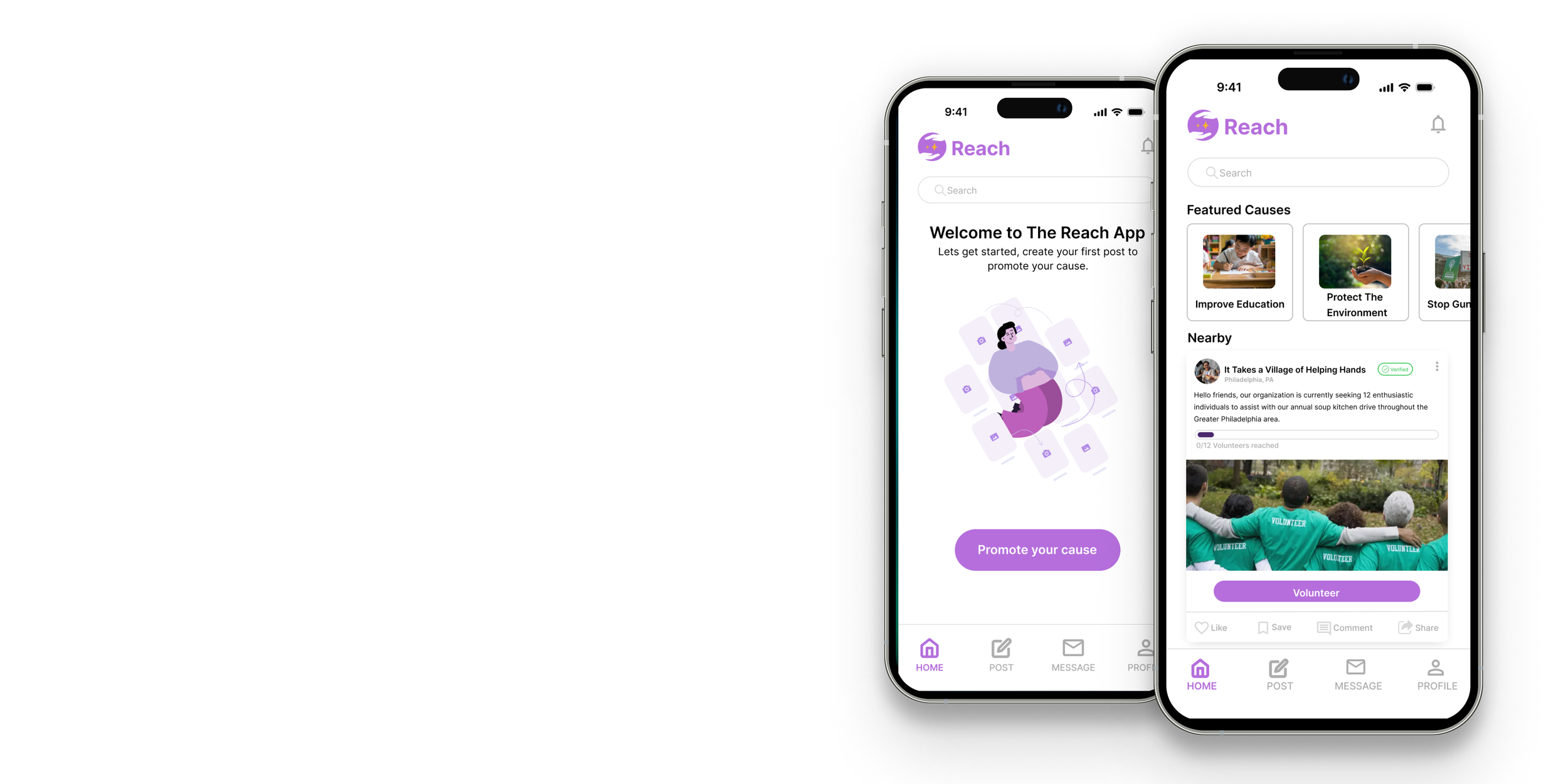
Overview: Reach is a social media platform designed specifically for charitable organizations seeking to promote the causes and users looking to support these causes in an effort to make the world a better place.
Role: Sole UX/UI Designer
Responsibilities:
Research and gather insight through interviews and usability studies
Define and come up with solutions for the user’s problems
Ideate and Iterate design through wireframe, lo-fi and hi-fi prototypes
Duration: June 2024-Aug 2024
The Problem:
Charitable Organizations and their supporters need a platform that allows them to interact and spread awareness of their cause in a seamless manner.
The Goal:
Build a platform that can be used to raise awareness for charitable causes and connect organizations to their supporters, while providing exceptional user experience.
Design Process
1. Empathize: To gain a understanding of the user’s experiences and needs, I conducted:
2 stages of Initial user interviews
Research through Secondary sources
2.Define: In this phase, I synthesized the data collected in the empathize phase using:
User Personas
User Journey Maps
3.Ideate: In this phase, I went on to create possible solutions through.
User flows
Information Architecture
Site Map
Wireframes
4.Prototype: I created sample products for testing through:
Low Fidelity Prototypes
High Fidelity Prototypes
5.Test: In this phase, to gain useful feedback to better improve the design, I carried out:
Usability Study
Empathize
Lets take a look at our Research data
User Research:
At the time of working on this project, I was working as a relationship banker, this gave me access to charitable organizations within my book of business, some of which were kind enough to allow me to interview them for this project. I spoke the with the president, vice president and secretary from 5 organizations and gain the following insight.
I then went on to conduct another round of interviews with 10 participants, 5 of whom volunteer at local charitable organizations and the remaining 5 who donate to their favorite causes on a regular basis.
Organization Insight:
5 out of 5 state that their organization is challenged by Lack of funding
2 out of 5 state that their organization is challenged by Lack of business mindedness
4 out of 5 state that their organization is challenged by Lack of volunteers
5 out of 5 state that their organization is challenged by Lack of Exposure
Interview Results
Secondary Source:
I decided to use secondary sources to support the data gathered from the initial interviews. According to Statista.com in their 2023 article, entitled “Biggest Challenges for nonprofit organizations in the united states in 2023,”
21.23% Are challenged by Lack of Awareness/Communication
20.95% Have a high staff turnover rate.
29.25% Have Difficulty Recruiting & Retaining Quality Staff.
28.17%Have Difficulty Acquiring & Retaining Donors.
46.48% Are impacted by Rising Operating Expenses
41.59% Experience a lack of Adequate Finances/Resources.
Volunteer/Donor Insight
Volunteer specific:
2 out of 5 Volunteers find opportunities through websites like Volunteermatch.org
3 out of 5 Volunteers find opportunities through direct contact with their local organizations.
3 out of 5 Volunteers state that they do not feel appreciated by their organization.Donor Specific:
3 out of 5 Donors experience Trouble believing/trusting the organizations that they make their donations to.
4 out of 5 Donors state that they make their donations online via credit/debit card.
General Specifics:
8 out 10 Users stay up to date with causes through social media (eg. Facebook, instagram, twitter) & chat channels(eg. whatsapp, telegram, imessage)
6 out of 10 Users state that they
Based on the data gathered from research process, I was able to conclude on these pain points to address in the design.
Pointing out the Pain Points
Organization Pain points
Lack of Awareness/Exposure.
Difficulty recruiting and retaining volunteers.
Lack of funding (including acquiring and retaining donors).
Volunteer Pain Points
Lack of direct sources for Volunteer Opportunity.
Lack of appreciation from organization.
Donor Pain Points
Difficulty trusting/believing organizations.
Solving the user’s pain points
To address the Organization’s pain points:
The platform was created to allow organizations to spread their awareness and gain exposure
Organizations were given a create a post feature, in which they can seek to gain funding through donation and gain volunteer help from users seeking to give back to their community.
To Address The volunteer Pain Points
The Platform helps users quickly find and apply for volunteer opportunities from various organizations in one location.
Users can interact with an organization's volunteer post, then receive a confirmation notification. A leader from the organization will then have the opportunity to provide them with additional information.
To address Donor Pain points:
To allow Donors to be able to easily find and connect with trustworthy organizations, the organizations were given the option to provide The Reach app with identifying documentation to become verified. This would increase their trustworthiness and validity to users.
Define
Taking A Closer Look at our users
In this stage, I went on to attribute the the pain points and characteristics of the users to 2 representative personas.
User Personas
Problem Statement
Tasha’s Problem Statement
Tasha is a the president of a charitable organization. She needs a platform to help her share her cause with a wider audience, so that she can raise awareness and gain more support for their cause
Ryan’s Problem Statement
Ryan is a famous direct and activist in his local community, who is looking for more ways that he can give his support to trustworthy causes. He needs a platform that will allow him to easily find and give his support to his favorite causes.
User Journey Map
After creating my personas and their respective problem statements, I then went on to create their user journey map. The journey map is used to highlight the path the user takes to address their need, highlighting their emotions through the process.
Ideate
Navigating through the Reach App
User Flow
To begin the Ideation process, I first created the user flow to show how the users will navigate through the platform’s main task feature.
Information Architecture
After creating the User Flow, I then went on to create the Information Architecture for the mobile app, to determine the content and its structure. This will allow the user to better understand where they are in the app and the information that they are looking for. I create 2 Information Architectures to represent the apps feature as they relate to each user specifically, that is, if they are a organization or volunteer/donor.
Paper & Low Fidelity Wireframes
I then went on to rapidly sketch potential designs for the app choosing parts of each sketch to ultimately develop a final sketch.
From the wireframe sketches I went on to create digital wireframes
Prototype
Adding Interaction to our design
In this phase of the design process, I went on to add interaction to the digital wireframe, to showcase how the app with operate as users navigate through the main user flow.
Test
Testing early concepts
After creating the Low Fidelity Prototype, I went on to test the app to see how to see how users will interact with it and use their feedback to improve the app.
I carried out 2 sessions of moderated usability studies, with a total of 9 participants. the first session included 5 participants testing the organization’s main user flow. The second session include 4 new participants that would be testing the Volunteer/Donor user flow. The data from each study was recorded in my usability notes excel sheet.
Usability Study
View Organization notes
Insight and Test Results
From the data I organized my observations in a affinity map, grouping the most notable quotes from each participant by the prompt.
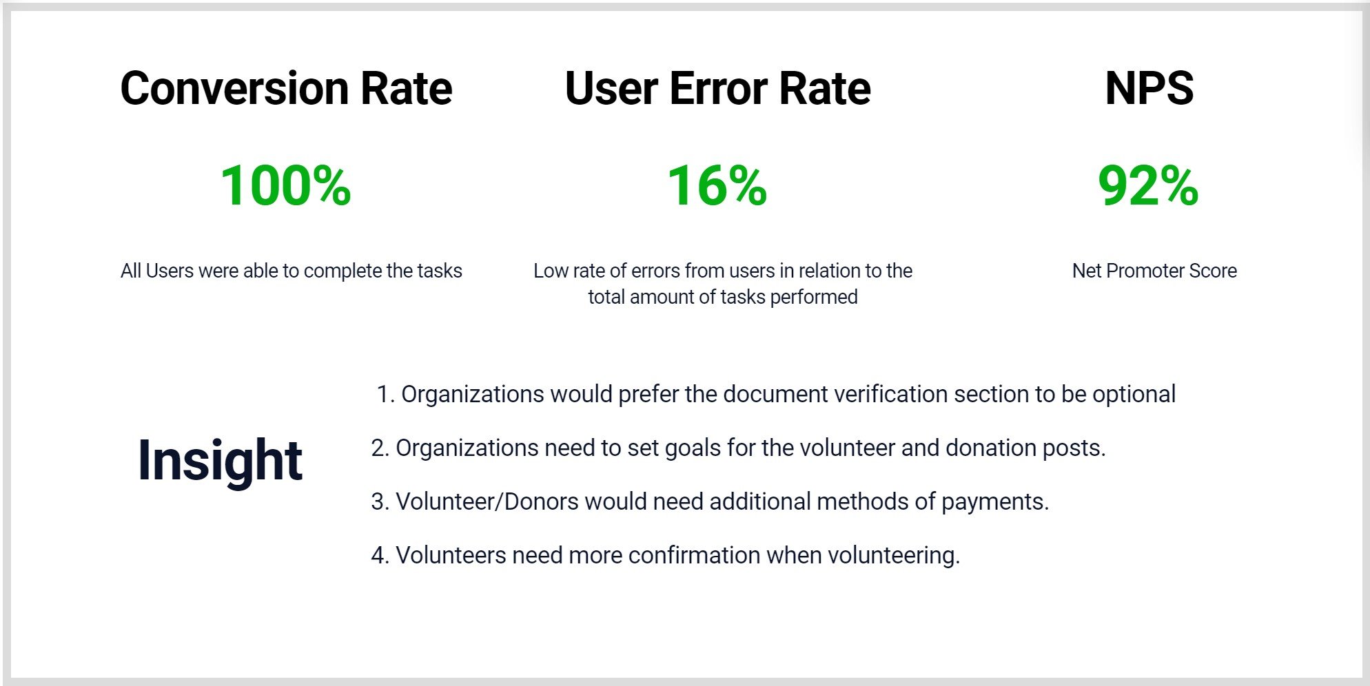
Key Performance Tracker

Improvements made by User Insight
1. Organizations would prefer the document verification section to be optional
2. Organizations need to set goals for the volunteer and donation posts.
3. Donors would need additional methods of payments
4. Volunteers need more confirmation when volunteering.
High Fidelity Design
This was definitely my favorite part of the process where I went on to iterate on the user pain points and usability insights. And bring life to the design through adding color, icons and refining the typography.
View High Fidelity Prototype
Takeaway:
This project significantly helped me to gain a better understanding of the app's main purpose and effectively laid the groundwork for my overall design approach. I learned that when designing for various screen sizes, we need to carefully consider what elements and information to display in order to enhance the user experience.
Next Steps:
1
Obtain UX/UI feedback from designers with more experience in the field to improve design.
2
When I have documented all feedback that was provided, I will make the necessary design updates in order to improve the app’s overall experience.
3
Create a cross-platform responsive design. The goal is to build the same experience for all users, no matter what type of device they are using.


